/*-----------------------------------------------------------.
/ Choose effects /
'-----------------------------------------------------------*/
// Set to 1 for ON or 0 for OFF
#define USE_SMAA_ANTIALIASING 1 // [0 or 1] SMAA Anti-aliasing : Smoothens jagged lines.
#define USE_LUMASHARPEN 1 // [0 or 1] LumaSharpen : Also sharpens the antialiased edges which makes them less smooth - I'm working on fixing that.
#define USE_BLOOM 0 // [0 or 1] Bloom : Makes bright lights bleed their light into their surroundings (relatively high performance cost)
#define USE_HDR 0 // [0 or 1] HDR : Not actual HDR - It just tries to mimic an HDR look (relatively high performance cost)
#define USE_TECHNICOLOR 0 // [0 or 1] TECHNICOLOR : Attempts to mimic the look of an old movie using the Technicolor three-strip color process (Techicolor Process 4)
#define USE_DPX 0 // [0 or 1] Cineon DPX : Should make the image look like it's been converted to DXP Cineon - basically it's another movie-like look similar to technicolor.
#define USE_LIFTGAMMAGAIN 1 // [0 or 1] Lift Gamma Gain : Adjust brightness and color of shadows, midtones and highlights (avoids clipping)
#define USE_TONEMAP 1 // [0 or 1] Tonemap : Adjust gamma, exposure, saturation, bleach and defog. (may cause clipping)
#define USE_VIBRANCE 1 // [0 or 1] Vibrance : Intelligently saturates (or desaturates if you use negative values) the pixels depending on their original saturation.
#define USE_CURVES 0 // [0 or 1] Curves : Contrast adjustments using S-curves.
#define USE_SEPIA 0 // [0 or 1] Sepia : Sepia tones the image.
#define USE_VIGNETTE 0 // [0 or 1] Vignette : Darkens the edges of the image to make it look more like it was shot with a camera lens. May cause banding artifacts.
#define USE_DITHER 0 // [0 or 1] Dither : Applies dithering to simulate more colors than your monitor can display. This lessens banding artifacts (mostly caused by Vignette)
#define USE_SPLITSCREEN 0 // [0 or 1] Splitscreen : Enables the before-and-after splitscreen comparison mode.
/*-----------------------------------------------------------.
/ SMAA Anti-aliasing settings /
'-----------------------------------------------------------*/
#define SMAA_THRESHOLD 0.05 // [0.05 to 0.20] Edge detection threshold
#define SMAA_MAX_SEARCH_STEPS 16 // [0 to 98] Determines the radius SMAA will search for aliased edges
#define SMAA_MAX_SEARCH_STEPS_DIAG 6 // [0 to 16] Determines the radius SMAA will search for diagonal aliased edges
#define SMAA_CORNER_ROUNDING 0 // [0 to 100] Determines the percent of antialiasing to apply to corners.
// -- Advanced SMAA settings --
#define COLOR_EDGE_DETECTION 1 // [0 or 1] 1 Enables color edge detection (slower but slightly more acurate) - 0 uses luma edge detection (faster)
#define SMAA_DIRECTX9_LINEAR_BLEND 0 // [0 or 1] Using DX9 HARDWARE? (software version doesn't matter) if so this needs to be 1 - If not, leave it at 0.
/*-----------------------------------------------------------.
/ LumaSharpen settings /
'-----------------------------------------------------------*/
// -- Sharpening --
#define sharp_strength 2.00 // [0.10 to 3.00] Strength of the sharpening
#define sharp_clamp 0.035 // [0.000 to 1.000] Limits maximum amount of sharpening a pixel recieves - Default is 0.035
// -- Advanced sharpening settings --
#define pattern 2 // [1|2|3|4] Choose a sample pattern. 1 = Fast, 2 = Normal, 3 = Wider, 4 = Pyramid shaped.
#define offset_bias 1.0 // [0.0 to 6.0] Offset bias adjusts the radius of the sampling pattern.
// I designed the pattern for offset_bias 1.0, but feel free to experiment.
// -- Debug sharpening settings --
#define show_sharpen 0 // [0 or 1] Visualize the strength of the sharpen (multiplied by 4 to see it better)
/*-----------------------------------------------------------.
/ Bloom settings /
'-----------------------------------------------------------*/
#define BloomThreshold 20.25 // [0.00 to 50.00] Threshold for what is a bright light (that causes bloom) and what isn't.
#define BloomPower 1.446 // [0.0000 to 8.0000] Strength of the bloom
#define BloomWidth 0.0142 // [0.0000 to 1.0000] Width of the bloom
/*-----------------------------------------------------------.
/ HDR settings /
'-----------------------------------------------------------*/
#define HDRPower 1.30 // [0.0 to 8.0] Strangely lowering this makes the image brighter
#define radius2 0.87 // [0.0 to 8.0] Raising this seems to make the effect stronger and also brighter
/*-----------------------------------------------------------.
/ TECHNICOLOR settings /
'-----------------------------------------------------------*/
#define TechniAmount 0.11 // [0.0 to 1.0]
#define TechniPower 2.8 // [0.0 to 8.0]
#define redNegativeAmount 0.88 // [0.0 to 1.0]
#define greenNegativeAmount 0.88 // [0.0 to 1.0]
#define blueNegativeAmount 0.88 // [0.0 to 1.0]
/*-----------------------------------------------------------.
/ Cineon DPX settings /
'-----------------------------------------------------------*/
#define Red 8.0 // [1.0 to 15.0]
#define Green 8.0 // [1.0 to 15.0]
#define Blue 8.0 // [1.0 to 15.0]
#define ColorGamma 2.5 // [0.1 to 2.5] Adjusts the colorfulness of the effect in a manner similar to Vibrance. 1.0 is neutral.
#define DPXSaturation 3.0 // [0.0 to 8.0] Adjust saturation of the effect. 1.0 is neutral.
#define RedC 0.36 // [0.6 to 0.2]
#define GreenC 0.36 // [0.6 to 0.2]
#define BlueC 0.34 // [0.6 to 0.2]
#define Blend 0.2 // [0.0 to 0.1] How strong the effect should be.
/*-----------------------------------------------------------.
/ Lift Gamma Gain settings /
'-----------------------------------------------------------*/
#define RGB_Lift float3(0.925, 0.925, 0.925) // [0.000 to 2.000] Adjust shadows for Red, Green and Blue
#define RGB_Gamma float3(1.000, 1.000, 1.000) // [0.000 to 2.000] Adjust midtones for Red, Green and Blue
#define RGB_Gain float3(1.100, 1.100, 1.100) // [0.000 to 2.000] Adjust highlights for Red, Green and Blue
/*-----------------------------------------------------------.
/ Tonemap settings /
'-----------------------------------------------------------*/
#define Gamma 1.0 // [0.00 to 2.00] Adjust midtones
#define Exposure 0.00 // [-1.00 to 1.00] Adjust exposure
#define Saturation 0.00 // [-1.00 to 1.00] Adjust saturation
#define Bleach 0.10 // [0.00 to 1.00] Brightens the shadows and fades the colors
#define Defog 0.050 // [0.00 to 1.00] How much of the color tint to remove
#define FogColor float3(1.50, 0.25, 1.50) // [0.00 to 1.00, 0.00 to 1.00, 0.00 to 1.00] What color to remove - default is blue
/*-----------------------------------------------------------.
/ Vibrance settings /
'-----------------------------------------------------------*/
#define Vibrance -0.30 // [-1.0 to 1.0] Intelligently saturates (or desaturates if you use negative values) the pixels depending on their original saturation.
/*-----------------------------------------------------------.
/ Curves settings /
'-----------------------------------------------------------*/
#define Curves_contrast 0.30 // [-1.0 to 1.0] The amount of contrast you want
// -- Advanced curve settings --
#define Curves_formula 7 // [1|2|3|4|5|6|7] The constrast s-curve you want to use.
/*-----------------------------------------------------------.
/ Sepia settings /
'-----------------------------------------------------------*/
#define ColorTone float3(1.40, 1.10, 0.90) // [0.00 to 1.00, 0.00 to 1.00, 0.00 to 1.00] What color to tint the image
#define GreyPower 0.11 // [0.0 to 1.0] How much desaturate the image before tinting it
#define SepiaPower 0.58 // [0.0 to 1.0] How much to tint the image
/*-----------------------------------------------------------.
/ Vignette settings /
'-----------------------------------------------------------*/
#define VignetteRadius 1.18 // [-1.00 to 3.00] lower values = stronger radial effect from center
#define VignetteAmount -2.00 // [-2.00 to 1.00] Strength of black. -2.00 = Max Black, 1.00 = Max White.
#define VignetteSlope 8 // [1 to 16] How far away from the center the change should start to really grow strong (odd numbers cause a larger fps drop than even numbers)
#define VignetteCenter float2(0.500, 0.500) // [0.00 to 1.00] Center of effect.
/*-----------------------------------------------------------.
/ Dither settings /
'-----------------------------------------------------------*/
//No settings yet, beyond switching it on or off in the top section.
//Note that the checkerboard pattern used by Dither, makes an image harder to compress.
//This can make your screenshots and video recordings take up more space.
/*-----------------------------------------------------------.
/ Splitscreen settings /
'-----------------------------------------------------------*/
#define splitscreen_mode 3 // [1|2|3|4|5] 1 = Vertical 50/50 split, 2 = Vertical 25/50/25 split, 3 = Vertical 50/50 angled split, 4 = Horizontal 50/50 split, 5 = Horizontal 25/50/25 split
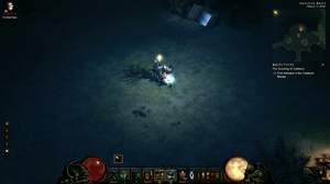
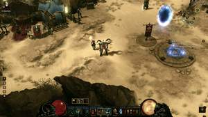
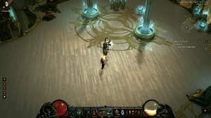
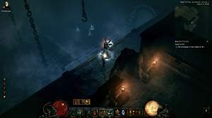
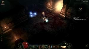
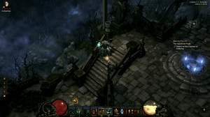
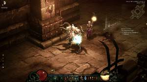
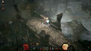
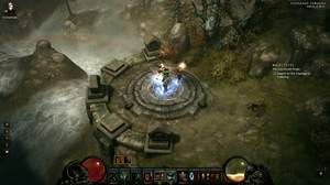
I must say I really like this one. It does look realistic, with blue tint removed, and I like that the colors are not oversaturated/vibrant, like in most other presets. Also, it's not overly dark (I have a monitor with really big contrast), so I don't have to mess with gamma/brightness in order to feel right...really balanced look. Great job!